
Among the most important considerations in web design is understanding how websites look on all devices, but this can be tricky. That said, one thing that makes things easier in this regard, is the viewport. Knowing how it works, can affect everything from how your website feels, to how well it ranks on Google. So, let me begin by writing about what a viewport is, why it is so important and how it helps, when it comes to web design.
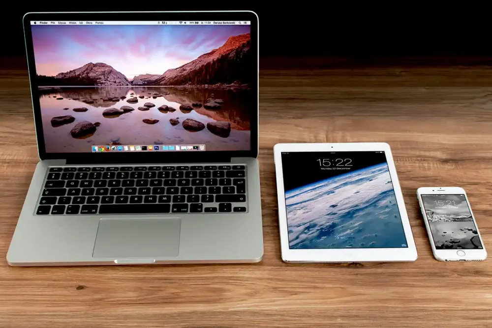
As you may know, responsive web design is a must in the 21st Century. That is because more people use phones, tablets and laptops to browse websites, than from desktop computer monitors. This means your website must adapt to different screen display sizes. That is where the viewport plays a key role in how pages are shown across devices. So, when you understand how to build websites with viewports in mind, you can improve user experience, improve your SEO rankings and increase conversion rates.
What is a Viewport in Web Design?
As mentioned in a previous article, the viewport represents the area within a web page that is viewable via a web browser (without scrolling). Think of it as the window through which you view a web page. That said, the viewport is different from your device’s screen size or resolution. The browser determines what part of the page is visible, based on the viewport dimensions. So, even if your device has a large screen, the browser may show only a part of your web page at any given moment.
The Role of the Viewport in Displaying Content
The viewport sets the limits of what you see on your device’s display screen. If the web page content is larger than the viewport, you will need to scroll to see the rest of the content. Responsive design uses the viewport to adjust the layout. For example, a website on a desktop computer monitor shows a different layout than on a smart phone. This ensures the site is readable and easy to navigate no matter the device.

The Difference Between Viewport and Screen Size
A common mistake is confusing screen size with viewport size. A smart phone might have a 6-inch screen, but the viewport might be much smaller. This is because browsers and devices often hide browser controls or other UI (User Interface) elements, making the visible content area smaller.
How the Viewport Impacts Web Design
Responsive vs. Fixed-Width Layouts
Responsive design adjusts to different viewport sizes. Fixed-width layouts keep the same size no matter what device you use. For responsive websites, the viewport guides how content scales. On desktop computers, web pages might be wider with extra space. On smart phones, web page elements stack vertically to fit smaller and narrower viewports.
The Viewport Tag in HTML
In web design, we use the <meta name=”viewport”> tag which is a simple line of code that tells browsers how to display your web page. It can set the width of the viewport, the initial zoom level and whether users can zoom in or out. Common attributes include width=device-width, which makes the page match the device’s width, and initial-scale=1, which sets the zoom level when the page loads. Proper setup of this tag helps your site look good on all screens.
Influence on User Experience (UX)
When your website fits nicely on a device, users find it easy to read and navigate. A poor viewport setup causes content to be cut off or too small to read. This leads to frustration and higher bounce rates. Testing your website on different devices is crucial to catch issues early. Keep in mind that if users struggle, they leave your website. Optimizing the viewport improves overall usability and user engagement.
Why the Viewport Is Critical for SEO
Search Engine Crawling and Indexing
Did you know that Google looks at how websites perform on mobile devices? That means if your website is not mobile-friendly, it can hurt your rankings in their SERPs. Following Google’s guidelines for their mobile-first indexing ensures that your website is indexed correctly and performs well in their search results.
Mobile Usability and Load Times
Believe it or not, a good viewport setup can help your web pages load faster and look better. When web page content is correctly scaled, there are fewer layout shifts enabling your web pages to load faster. Thus, responsive web pages rank higher and keep visitors engaged longer.
Accessibility and Inclusivity
A correctly set viewport supports users with disabilities. It allows for easier text scaling and zooming features. Google recommends accessible viewport practices to help all users navigate your website comfortably. Making your website inclusive benefits everyone and boosts your brand reputation.
Best Practices for Managing Viewports in Web Design
Testing on Multiple Devices and Browsers
Always check your website on various devices and browsers. Use tools like Chrome DevTools to see how your website behaves at different viewport sizes. This catches problems early and ensures a consistent experience for all visitors.
Incorporating Flexible Units and Media Queries
Use relative units like %, em, or rem instead of fixed pixels. This makes your content adapt better to different viewports. Combine this with media queries to change styles based on screen size. For example, you can make font sizes larger or smaller depending on the viewport width.
 EMAIL US