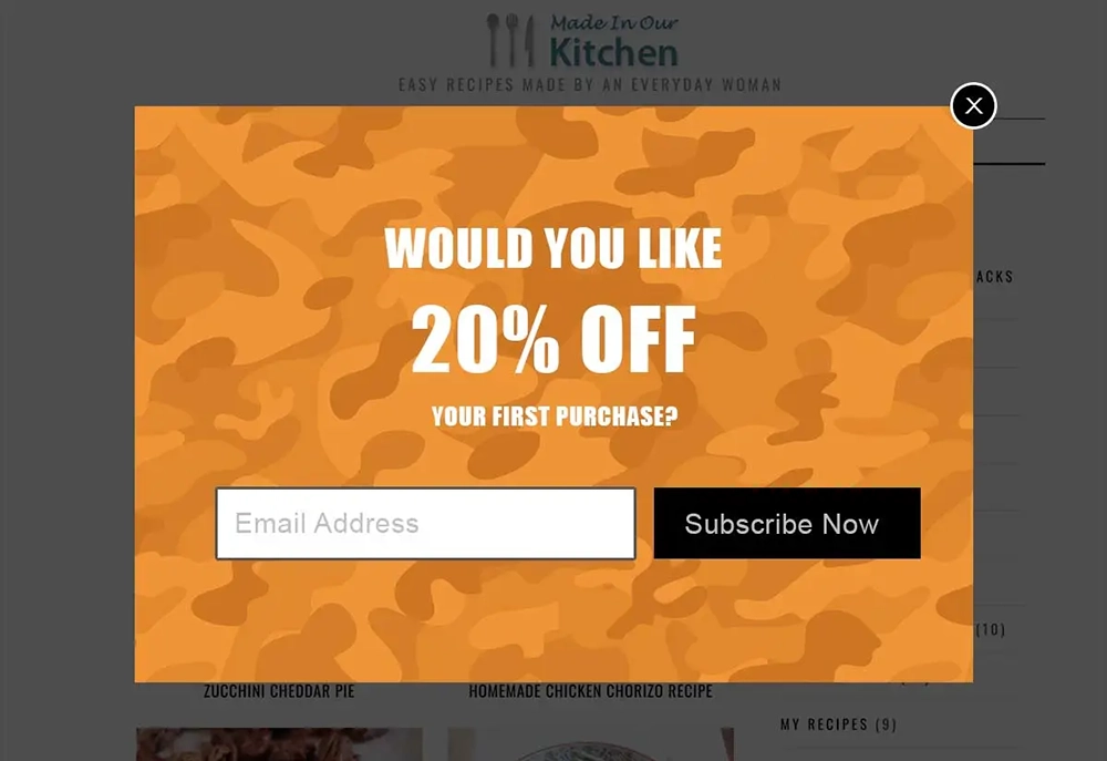
A call-to-action, or CTA, is a term used in marketing that refers to some type of unique content or page copy, designed to induce a desired action.
Example of a Call-to-Action
With respect to a web page, a call-to-action could be an online form, a linked image or button that prompts a website visitor to submit a contact form, learn more about a product or service or add a product to a shopping cart.
The Importance of a Call-to-Action
The primary goal of any business website is to facilitate the growth of new customers.
To that end, a CTA can help turn website visitors into customers by leading them through the sales process. That could be as simple as inducing website visitors to complete and submit a contact form to request more information or a phone call or incentivizing a web visitor to buy a product because of a CTA to sign up for a coupon code, etc.
3 Tips for Designing an Effective Call-to-Action
Eye Catching Design
An effective CTA is one designed to draw attention to it. A popular, eye catching CTA that many e-Commerce websites seem to be using lately is a discount off the first purchase popup. This type of CTA can be very effective because not only gets the website visitor’s attention, but it also engages them with a discount coupon code offer on their purchase after providing their email address.

Time Sensitive Offer
A CTA that presents a time sensitive offer is quite an effective method by which you can induce a website visitor to make a purchase. It could be a time-limited special discount or a limited remaining stock notification.
Be Honest
Never mislead a potential customer into clicking on a CTA that brings them to information that is not relevant. Let’s face it, no one likes click bait.
That is why it is very important that you make sure your CTAs are honest and deliver the information promised…be concise and accurate in your CTA verbiage.