

With the advent of all types of mobile devices and computers, people worldwide browse websites from all a wide range of devices. From smartphone and tablet displays to wider laptop and ultra-widescreen desktop monitors, there is a huge variation in size. As such, in order to render as intended across a wide variety of display sizes, your website needs to be “responsive”. That is where responsive web design comes into play.
What Exactly is Responsive Design?
Simply put, responsive design is the web design approach that focuses on creating a website layout that seamlessly adapts to the “viewport” within the display screen from which it is being viewed. The viewport represents the area within a web page that is viewable via a web browser (without scrolling). Thus, the idea behind responsive design is to avoid creating separate websites for each device, by instead utilizing a single website, which can dynamically adjust its layout, content and navigation, based on the size of the device’s viewport, used by the website visitor. And media queries are the secret ingredient that makes all this possible.
What Are CSS Media Queries?
Media queries are a way to make a website change the way it looks, using different styles, based on the viewport size of the device being used. Media queries are actually just a part of CSS, the style sheet language for website pages. When a media query matches certain conditions, such as the screen width, they apply different CSS rules. One way to think about media queries is that they tell your website that when the viewport is this wide, then do this. This helps web pages adjust their layout, fonts and images to provide an optimal user experience when viewing a web page, no matter the size of the device being used.
About Media Queries
Media queries did not suddenly appear overnight. They came into play with CSS3, around 2012, out of a desire to develop more flexible web pages in the face of ever-expanding growth of mobile and desktop device displays. So, before the introduction of media queries, websites simply utilized fixed widths. That meant in order to view web page content from your smartphone, you would need to be zooming and pinching. Now, with media queries, designs can shift and resize. Thus, this shift from fixed layouts to dynamic ones, has changed how we design and build websites.
Why Are Media Queries So Critical?
As more and more people browse websites from their smartphones and tablets, this shift in device usage has affected search engine rankings too. For example, Google began it rolling out its mobile-first indexing in 2016. By September 2020, Google committed to fully switching to mobile-first indexing for all websites. This means that Google’s smartphone agent crawls the mobile version of a website’s content first, for indexing and ranking. Thus, use media queries as a way to make a website responsive, helps Google to identify mobile-friendly content for its mobile-first indexing. Websites that do not utilize media queries can also result in reduced conversions and lead to higher bounce rates and lost visitors.
How Media Queries Work
Syntax and Basic Structure
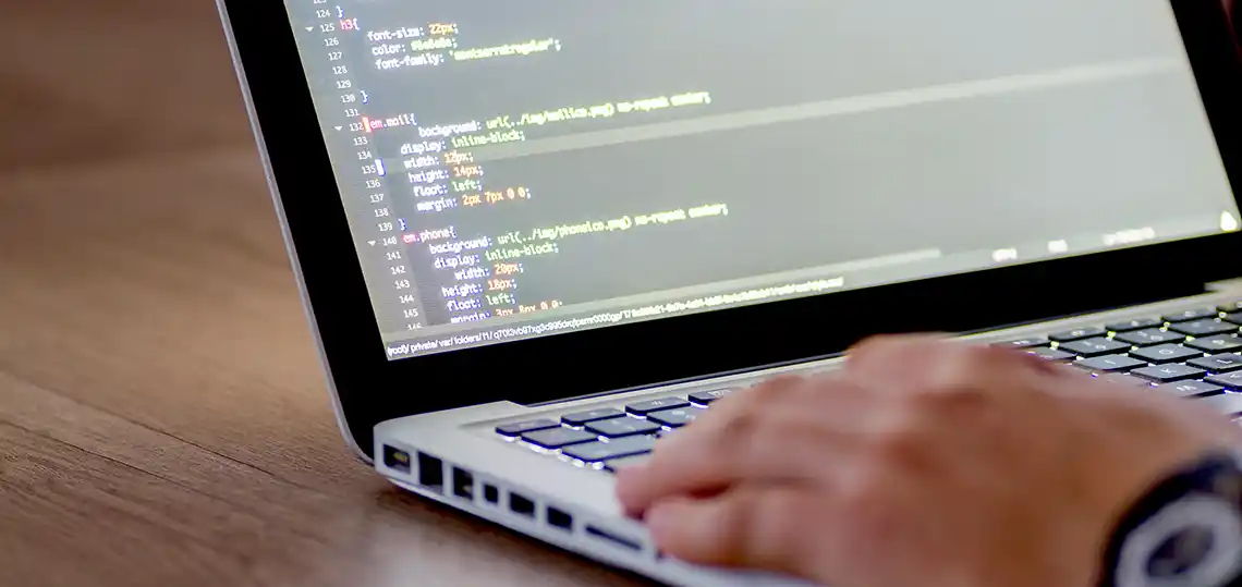
A media query starts with the @media rule in CSS. You specify the conditions, like screen size or orientation, then include the styles inside curly braces.
Here’s a simple example:
@media only screen and (max-width: 768px) { body {background-color: #fff; } }
This means, when the screen width is 768 pixels or less, the web page body background color becomes white. Thus this media query is applicable only when the condition matches.
Building Responsive Layouts
Media queries help create flexible grid systems that adjust to the screen size. For example, a three-column layout on desktop can turn into a single column on a mobile device. Navigation menus can also switch from a full menu to a hamburger icon, saving space and making navigation easier.
Enhancing User Experience
Images can be scaled or replaced with smaller versions based on screen size. This helps pages load faster, particularly on slower connections such as often found on a cellular network. Besides images, text size and spacing can be increased or decreased for readability. Moreover, touch targets like buttons can be made bigger for mobile users.

Best Practices for Implementing Media Queries
Mobile-First Approach
Websites should be designed for small screens first. Then, add media queries to enhance or reposition elements for larger screens. Studies have shown that this approach can minimize issues and improve load times.
Keep Media Queries Maintainable
Organize your CSS with comments and separate files. Use relative units like percentages, ems, or rems instead of fixed pixels. This makes tweaking styles easier and your code cleaner.
Testing and Debugging
Test your site on real devices if possible. We like to use browser tools like Chrome DevTools or Firefox Developer Edition. Common mistakes include overlapping styles or missing breakpoints. Regular testing helps to ensure that your website renders as intended across all devices.
Performance Considerations
Minimize the number of media queries and CSS rules. This helps to make your website faster, which keeps visitors happier and can improve your rankings in the SERPs. So, there you have it. Media queries are literally the backbone of responsive websites. They enable your website to look good across device screens of all sizes by changing styles based on the size of the device’s viewport.
 EMAIL US