
Back in the day, when newspapers were still a thing, above the fold was a term coined by that industry, where any information that was above the top half of the newspaper was called “above the fold”. The information that was printed above the fold was considered to be the most important.
Since then, above the fold has been used with respect to website pages.
What does Above the Fold mean for Websites?
Above the fold for websites refers to the content/information on a web page that is immediately viewable before scrolling downward begins. Obviously, above the fold can vary depending on the type of device being used. In other words, above the fold content may be different on a smart phone, then on a laptop computer or desktop computer monitor, particularly when it comes to responsive design. That is because of the different sized viewports (screen size). In fact, web developers commonly use media queries to conditionally apply CSS styles for responsive design, based on a browser viewport width.
What Kind of Content is Above the Fold on a Web Page?
Typically, above the fold web page content is that which is most relevant to most visitors and may encourage them to stay on your website to continue browsing other pages. Here are some common types of above the fold web page content.
Company Logo
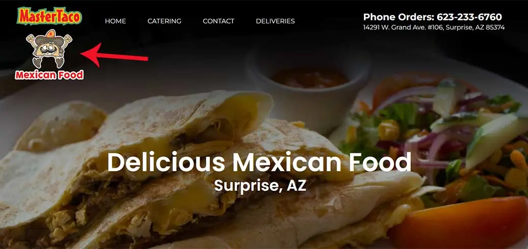
In the United States, people read left to right, and top to bottom. So, the first thing that most website visitors will usually see is the company logo, because our eyes would first look at the top left corner of the web page, which is usually where the company logo is positioned. This tells website visitors who you are, and in some cases, what you do (i.e. Master Taco Mexican Food, Detroit Personal Injury Lawyers, etc.).
Navigation Menu and Contact Information
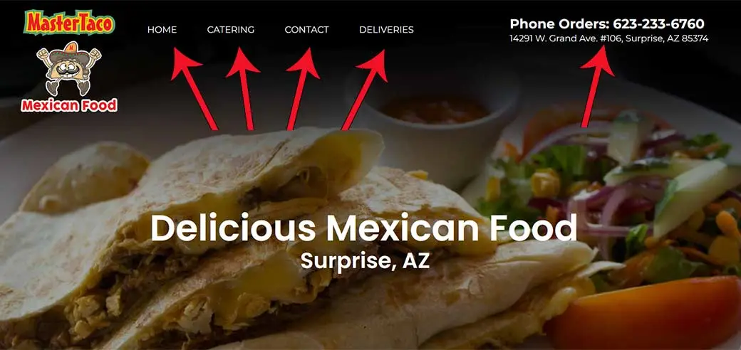
So, reading left to right and top to bottom, after seeing your company logo, typically, the next thing visitors should see is your website navigation/menu links and contact information. Navigation is an essential element of your website in that it should be readily available and easy to use.
Additionally, it is a good idea to have your contact information (i.e. phone number or contact us button) to make it easy and obvious for visitors to be able to contact you.
Hero Image with Important/Relevant Message
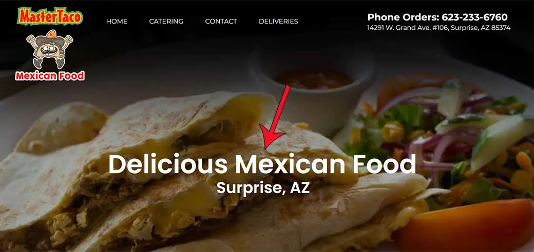
The hero image (in some cases an image slider, slideshow or carousel) is a very popular element to have above the fold on the home page of a website. That is because it visually supports a company’s most important message to visitors. And because it is usually placed immediately below the logo and navigation, it garners a lot of attention from the visitor.
For example, if you look at the website of Prominent Web Design, you will see a hero image of a team of people (web designers, developers) working in front of their monitors. The message “Affordable Web Design in Scottsdale” is placed over the hero image. Together the image supports the message that should convey the service we offer that may be most relevant to visitors.
Call-to-Action

For certain clients, they would like to have an above the fold placement of some calls-to-action. If you don’t know what a call-to-action is, you can read about it here.
A call-to-action or several of them, may indeed be important to highlight important products or services you offer that are immediately viewable above the fold.
Is Above the Fold Content Still Relevant in Web Design?
In 2023, it has been reported that website visitors spend nearly 60% of their time above the fold. That is quite significant! As such, optimizing websites for above the fold UI and UX design is indeed still relevant today as a strategy to maximize visitor conversions.
If you would like to learn more about the importance of above the fold web design, contact our professional Scottsdale web design team today at 480-306-4260.